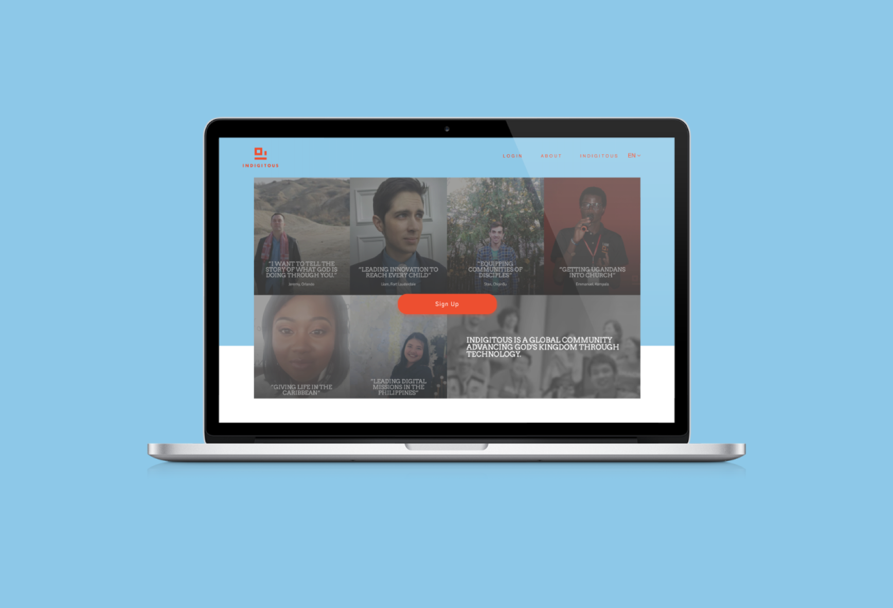
Distributed in August 2021, The Voke Quarterly featured a 7 page write-up of the product pivot discovery work I led. Below is a copy that feature.
RENOVATING GOOD BONES
The need has always been in front of us, but this new era of ministry has drawn it even closer. We needed to produce a digital platform that captures the invaluable spiritual and social dynamics foundational to the local church -- relationships, interactivity and community.To make community the central experience and content a supporting way to maintain momentum and focus, we would need to change the app.
In this quarter, our UX Designer, Ariel, led the effort to renovate Voke. Through a series of specific, strategic Sprints, we collaborated to renew the app by identifying, prioritizing, designing, testing and iterating the user experience.
In this edition of the Quarterly, we want to invite you into the transformation of Voke.From the first exercise, to the last interview, we’ve asked Ariel to tell you how we’ve taken steps to meet this arising need in ministry, inspiring you to do the same where God is leading you.
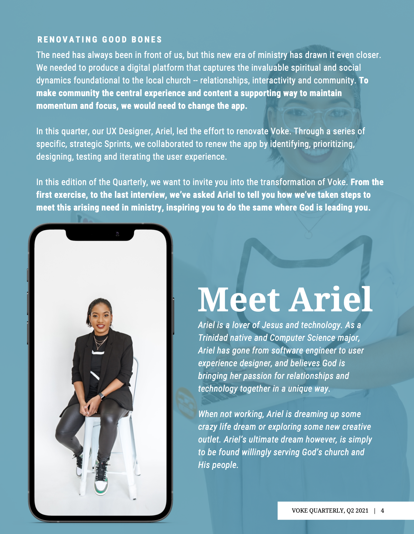
Meet Ariel
Ariel is a lover of Jesus and technology. As a Trinidad native and Computer Science major, Ariel has gone from software engineer to user experience designer, and believes God is bringing her passion for relationships and technology together in a unique way.
When not working, Ariel is dreaming up some crazy life dream or exploring some new creative outlet. Ariel’s ultimate dream however, is simply to be found willingly serving God’s church and His people.
DESIGN & DELIVERY
Starting with the flow
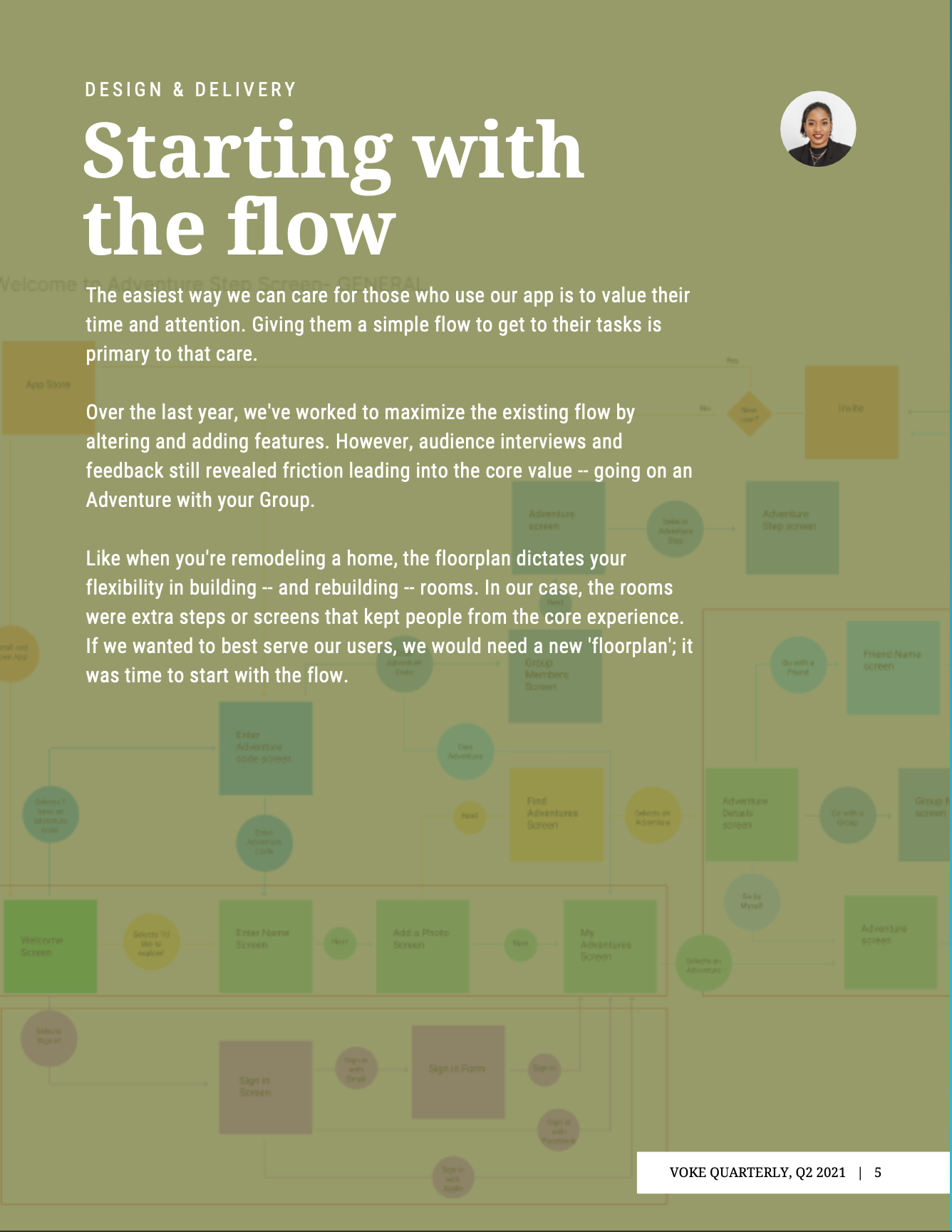
The easiest way we can care for those who use our app is to value their time and attention. Giving them a simple flow to get to their tasks is primary to that care.
Over the last year, we've worked to maximize the existing flow by altering and adding features. However, audience interviews and feedback still revealed friction leading into the core value -- going on an Adventure with your Group.
Like when you're remodeling a home, the floorplan dictates your flexibility in building -- and rebuilding -- rooms. In our case, the rooms were extra steps or screens that kept people from the core experience. If we wanted to best serve our users, we would need a new 'floorplan'; it was time to start with the flow.
& where you want to go.
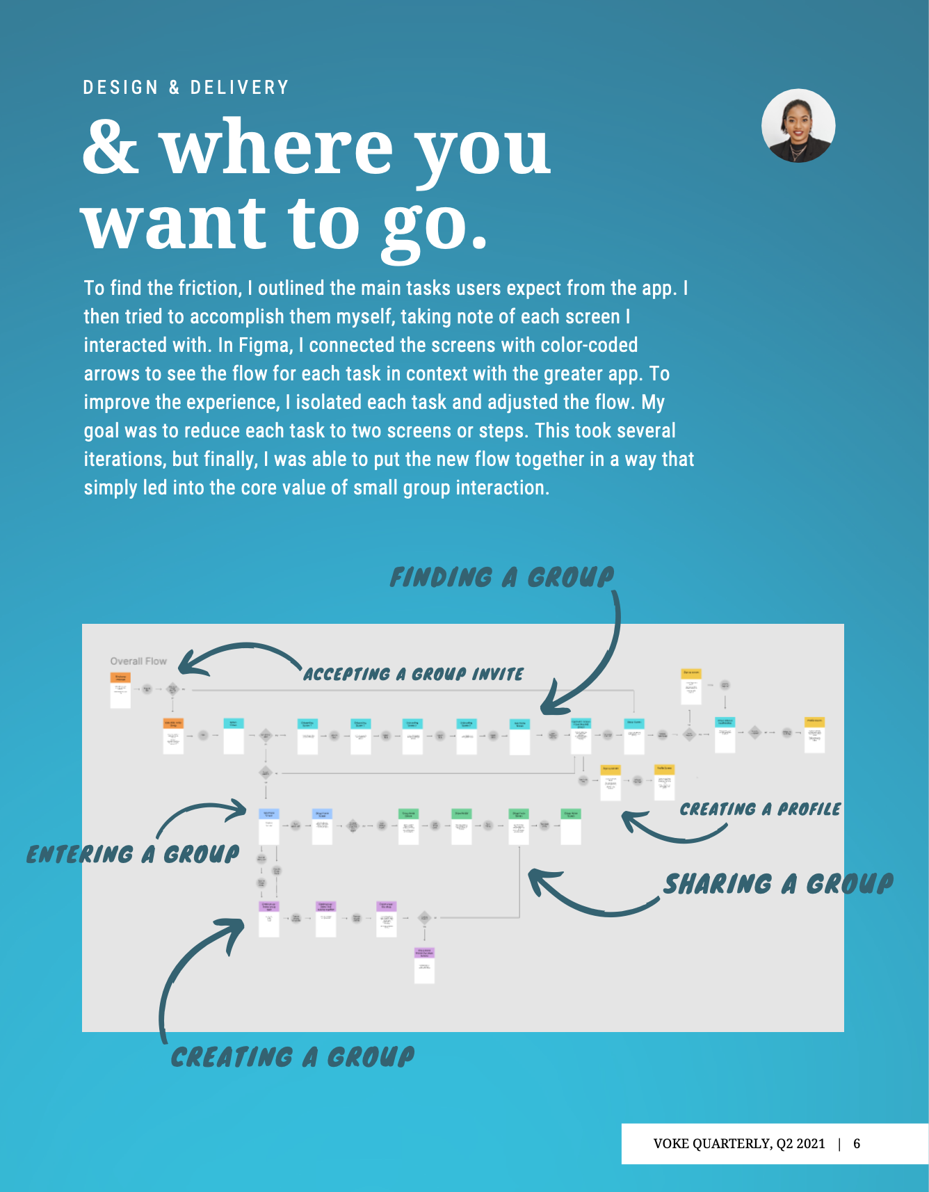
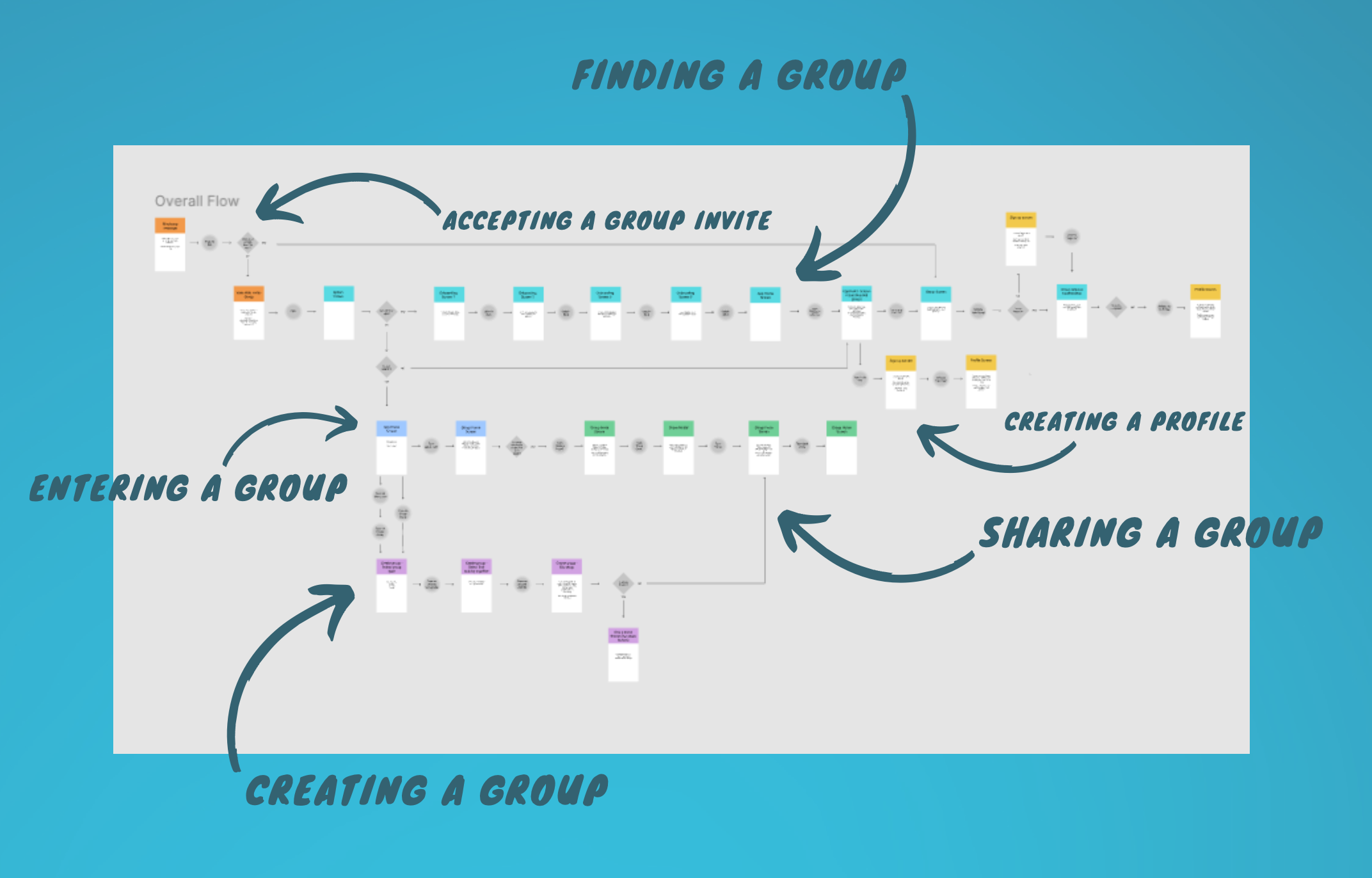
To find the friction, I outlined the main tasks users expect from the app. I then tried to accomplish them myself, taking note of each screen I interacted with. In Figma, I connected the screens with color-coded arrows to see the flow for each task in context with the greater app. To improve the experience, I isolated each task and adjusted the flow. My goal was to reduce each task to two screens or steps. This took several iterations, but finally, I was able to put the new flow together in a way that simply led into the core value of small group interaction.
Reimagining the goal.
In order to most closely mirror Jesus' heart for discipleship, we needed to offer small groups more than just video series. We also needed to provide more ways to expand beyond a question-and-discussion method, because not everyone has the same learning style. We brainstormed, and kept asking: how can we be a safe space to continually grow in your faith, while in community with others? This question helped us articulate the reality that content itself doesn't generate and sustain community. We would need features built for relationships and small group interaction to realize a long-standing, generational model of digital discipleship.
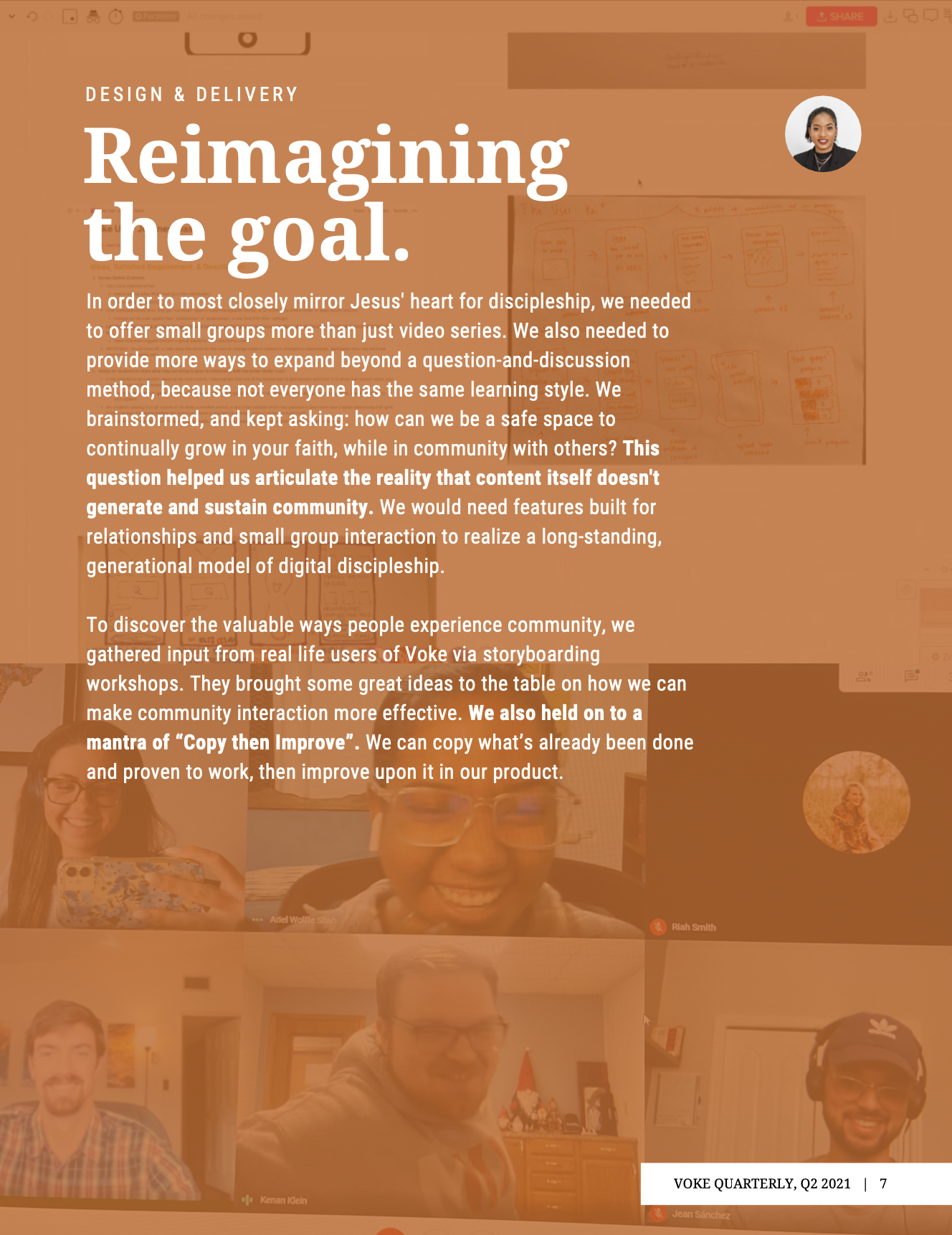
To discover the valuable ways people experience community, we gathered input from real life users of Voke via storyboarding workshops. They brought some great ideas to the table on how we can make community interaction more effective. We also held on to a mantra of “Copy then Improve”.We can copy what’s already been done and proven to work, then improve upon it in our product.
Knowing what you don't know.
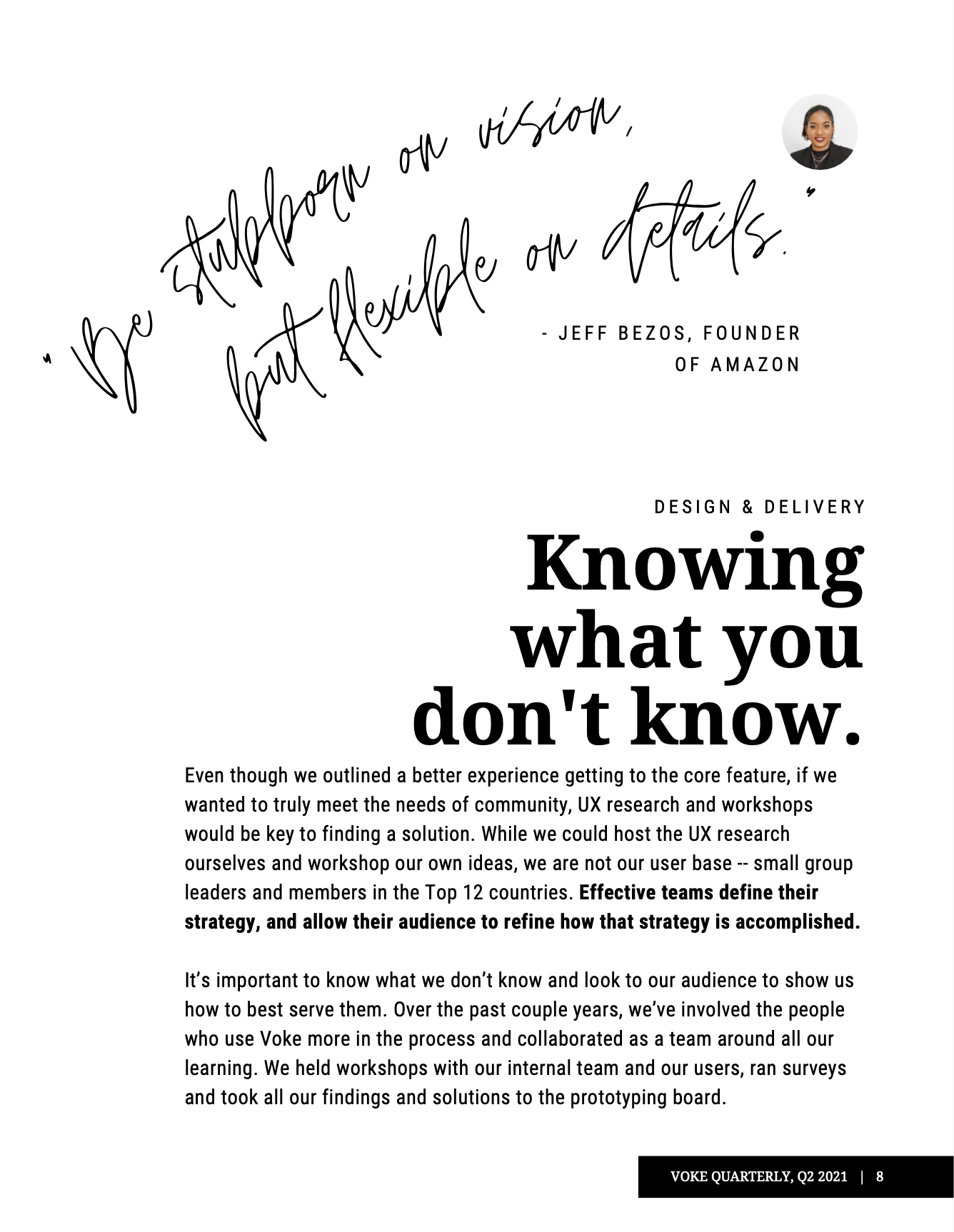
Even though we outlined a better experience getting to the core feature, if we wanted to truly meet the needs of community, UX research and workshops would be key to finding a solution. While we could host the UX research ourselves and workshop our own ideas, we are not our user base -- small group leaders and members in the Top 12 countries. Effective teams define their strategy, and allow their audience to refine how that strategy is accomplished.
It’s important to know what we don’t know and look to our audience to show us how to best serve them. Over the past couple years, we’ve involved the people who use Voke more in the process and collaborated as a team around all our learning. We held workshops with our internal team and our users, ran surveys and took all our findings and solutions to the prototyping board.
Validating your solution.
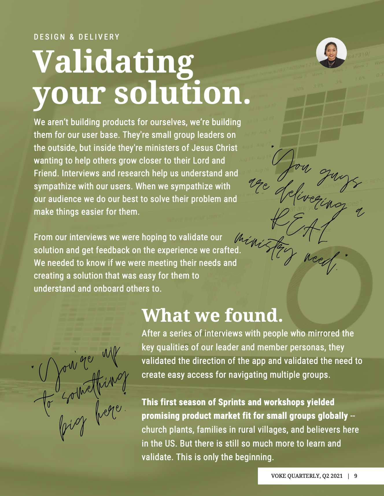
We aren’t building products for ourselves, we’re building them for our user base. They're small group leaders on the outside, but inside they're ministers of Jesus Christ wanting to help others grow closer to their Lord and Friend. Interviews and research help us understand and sympathize with our users. When we sympathize with our audience we do our best to solve their problem and make things easier for them.
From our interviews we were hoping to validate our solution and get feedback on the experience we crafted. We needed to know if we were meeting their needs and creating a solution that was easy for them to understand and onboard others to.
What we found.
After a series of interviews with people who mirrored the key qualities of our leader and member personas, they validated the direction of the app and validated the need to create easy access for navigating multiple groups.
This first season of Sprints and workshops yielded promising product market fit for small groups globally-- church plants, families in rural villages, and believers here in the US. But there is still so much more to learn and validate. This is only the beginning.
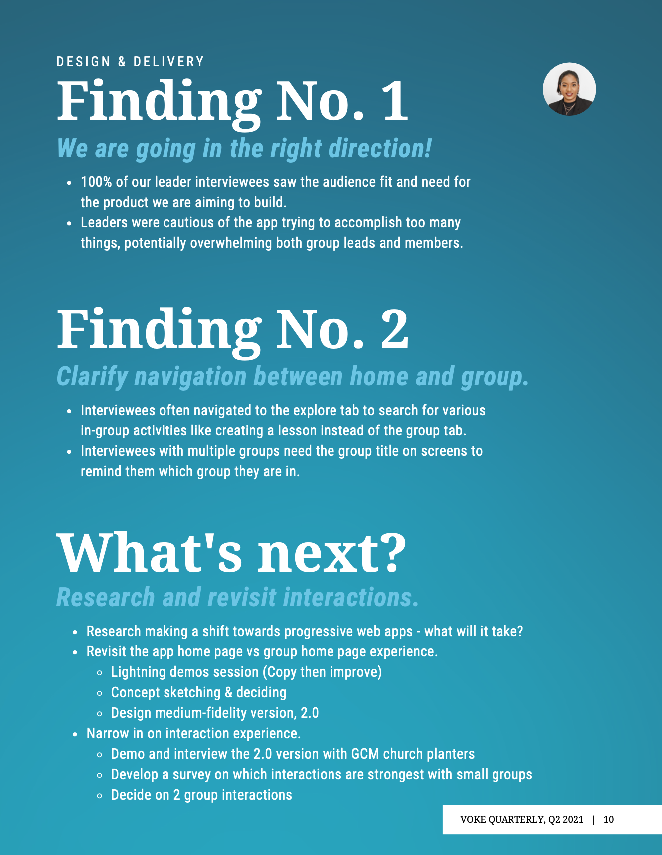
Finding No. 1
We are going in the right direction!
100% of our leader interviewees saw the audience fit and need for the product we are aiming to build.
Leaders were cautious of the app trying to accomplish too many things, potentially overwhelming both group leads and members.
Finding No. 2
Clarify navigation between home and group.
Interviewees often navigated to the explore tab to search for various in-group activities like creating a lesson instead of the group tab. Interviewees with multiple groups need the group title on screens to remind them which group they are in.
What's next?
Research and revisit interactions.
Research making a shift towards progressive web apps - what will it take? Revisit the app home page vs group home page experience.
Lightning demos session (Copy then improve) Concept sketching & deciding
Design medium-fidelity version, 2.0
Narrow in on interaction experience.
Demo and interview the 2.0 version with GCM church planters
Develop a survey on which interactions are strongest with small groups Decide on 2 group interactions
